To South Kensington and the Victoria & Albert Museum which famously bills itself as ‘the world’s leading museum of art and design’, a claim that’s always struck me as a bit ironic, since the place itself is so very oddly designed. Certainly, it’s very unlikely that any architect planning a new museum nowadays would copy the layout of the V&A with all its Neo-Gothic intricacies and idiosyncrasies. It’s one of those buildings that just seems to have no clear logic as to where anything comes and goes and one minute you can be looking at a corridor full of ancient Indian temple carvings and the next stumble into a massive room of Raphael cartoons, or else you’re liable to fall, Alice-like, into a dark, wonderland tunnel full of brightly lit jewellery only to emerge into the daylight faced by one of Landseer’s great fluffy dogs. I suppose the current V&A directorate would probably say it’s not their fault that everything is so unstructured, confusing and random and that they’re doing the best they can with the odd-shaped collection that they’ve inherited and the equally odd shaped building they’re stuck with, and that fitting one into the other isn’t an easy task.
Fair enough, I think to myself as I’m waiting in the queue for my ticket to get into the Botticelli exhibition. Then again, as I carry on waiting and waiting and the queue ambles so very slowly along, it strikes me that part of the reason for my wait is that there are no signs anywhere listing what exhibitions are on offer, how much the tickets cost, what concessions are available, or any other useful information like that. It’s only when reaching the front desk that one finally gets to see a small card listing the different shows and their various tariffs – £5 for me when I show my Art Fund card, which is pretty good value, as it turns out. But isn’t this lack of signage a rather obvious design fault? Had there been a larger, better-placed sign that could be read while waiting in the queue then I would have had my fiver at the ready and the whole process would have been just that little bit simpler, quicker and more efficient. And aren’t they the kind of desirable goals achieved by sensible design? Fortunately, after I get my ticket, I spot a woman standing at the members’ desk, above which is one of those clever electronic signs that continuously scrolls forth clever diagrams and other bits of graphic wizardry. Always one to try to help the world run more smoothly, I suggest to her that maybe something about the ticket prices could be added to this rolling display. She smiles and assures me that she will pass on my very useful idea to the relevant authorities and I’m almost convinced that she will keep her word and do exactly that. Well, she has one of those accents of such cut glass precision and adamantine enunciation that surely she can’t be dissembling just to get me to move along.
Being noted for the distinctively flat timbre of my own, dull vocal expression, I wouldn’t normally make a snarky remark about the way someone speaks except today the very next person I encounter, addresses me in a such a peculiar tone and manner, and it’s such extraordinarily contrast the previous person, that I feel I must record the experience. The entrance to the Botticelli exhibition seems to be guarded by some kind of human-cyborg chimera who takes a perverse delight in telling me that my timed ticket is for 11.30 and, since it is only 11.25, I must stand and wait. The voice of cold, bumptious authority is almost comic in its tone, bringing to mind the flat, unquestioning bureaucratic lack of humanity of a speak-your-weight-machine or perhaps of a former border guard at Checkpoint Charlie. Assuming the role of Professor Higgins, I go for the latter and can quite easily imagine that my unfair lady gatekeeper may have been one of those rare individuals who bribed the guards and risked the barbed wire to fight their way into the Soviet Sector, and then shed tears when the Wall finally came down. But, praise the lord, redemption is possible and evidently her recent years living within the benign embrace of a Western social democracy has had some effect as, at 11.27, she relents and lets me and the two other people she has pointlessly held up, proceed.
Once inside it’s not entirely unpleasant to be greeted by a pair of big screen sirens in the form of a bikini-clad Ursula Andress, emerging from the waves clutching a couple of shells, followed by naked Uma Thurman, her modesty protected solely by some strategically place strands from her unfeasibly long tresses. So, what is this duo of pulchritudinous hotties doing introducing an exhibition about a 15th century Renaissance master? Well, they’re examples of the cinema referencing Botticelli’s most famous creation, The Birth of Venus. Clearly, the show is not going to be just another boring old display of old-fashioned paintings for the crusties to nod to one another and mutter about in grudging appreciation. No, what we have here is the curatorial version of the vicar who unpacks his guitar and starts strumming his message in order to try to relate to the kids – and, right on, Rev. In museum speak, it’s an attempt to encourage the attendance of a wider demographic audience than that to which the Victoria & Albert usually manages to entice through its hallowed portals.
Oh well, despite my earlier hiccoughs en route to the show I’m feeling in a cheery mood, buoyed up by thoughts of Ursula and Uma and am willing to forgive this ever so slightly desperate attempt at cultural correctness. Although, when I get to the introductory wall panel at the start of the show I do wonder whether I should revert to my natural, grumpy stereotype, when I read that, ‘…the works of art in this exhibition are arranged in order from our own time to that of the artist’s.’ Surely there must be a slightly more mellifluous way to convey the concept that this tripartite exhibition, that aims to reveal Botticelli’s influence on artists from different eras, starts with art from the 20th century, is followed by works from the 19th and concludes with original pieces from Botticelli, his followers and contemporaries.
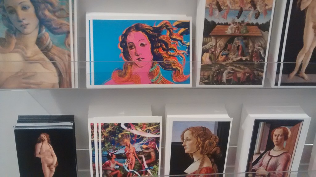
Quite why we are asked to start our cultural meal with the dessert goes unexplained, as does the curatorial logic for shrouding the opening rooms in such a deliberately dark setting. Suffice to say that spotlights highlight the recent art and couture inspired by the Botticelli brand. So, there are Dolce & Gabbana dresses decorated with bits of Renaissance collages, Andy Warhol’s prints of the face of Venus, a rather lovely Bill Viola video of people walking in slow motion, that was inspired by one of the master’s frescoes, and an assortment of various other Modern Art homages, parodies and rip-offs. The Magritte man with the Primavera stuck on his back, Joel-Peter Witkin’s photograph of a hermaphrodite posing as Venus and Dali’s collage of the goddess with the head of a codfish…are all quite diverting.
And in similar vein, it’s hard not to like some of the paintings and drawings in the middle room, which the interior decorator has decided to make much lighter, the black wallpaper of the first room superseded by a much lighter, eggshell blue background. Perhaps he thought this would reflect the Victorian taste for the light airy spaces in which they displayed the sultry beauties that Burne Jones and Rossetti produced as stationary precursors to our own Ursula and Uma. In fact, as the exhibition makes clear, the Pre-Raphaelite connection to Botticelli was deeper than just a shared interest in cheesecake. It seems that it was largely due to the Brotherhood’s interest in, and promotion of, Botticelli’s noticeably flat, early Renaissance style that lead directly to the general revival of interest in his works that had apparently, up until then, fallen into cultural desuetude. Of course, to a contemporary audience, it seems almost unbelievable that such an obviously brilliant talent, who could produce such wonderfully sharp and striking imagery could go out of fashion. But I suppose if one wanted to be generous, this curious phenomenon provides the fig leaf for showing not just Botticelli works but the other more recent artistic works that have been influenced by his stylistic tropes.
Whether that argument convinces or not, there are always the final rooms to enjoy, and in these shiny, glaring white spaces we finally get to see the Botticelli originals. This very decent range of works includes several items from the master’s studio, some doubtless painted by the man himself but many more probably painted by other hands but based on his designs, and then more still by other artists influenced by his sense of style. There are a stack of pietas, assumptions, flights to Egypt, meetings with John the Baptist, a large Pentecost and various other religious standards, and all have their interesting symbols to decipher, messages to give comfort, technical facility to enjoy and artistic fluency to appreciate. But, frankly, some of us prefer to get our inspiration from the secular and, ultimately, it’s the pair of matching, near-life size Venuses closing the show that make me stop and stare and think just what a very seminal artist was the great Signor Sandro B.