Look out the window when I get up and there’s a thin layer of mist blurring everything outside but, as that slowly dissipates and the sun comes out, it feels like it could be the first day of Spring…which prompts me to act like a lonely cloud and go for a wander about. So, starting off at Baker Street, I head down Marylebone High Street to get to Jaggedart, which looks a bit more full of art than usual. The exhibitions here are always very stylishly presented but sometimes perhaps just a little too chic and refined for my rougher sensibilities. I can’t help thinking that if ever I put one of their artworks on a wall, chez Berman, it would make everything else in the room look a tad shabby in comparison and I’d then have to declutter, redecorate, refurbish and start polishing, dusting and generally tidying things up…which, even for the sake of art, is not a lifestyle change that I’m quite ready to make just yet. Anyway, today is different and the gallery looks less like it’s preparing for a fashion shoot in a super cool interior décor mag and more like a cross between a mini Aladdin’s cave and a slightly updated Old Curiosity Shop. Or, giving up on these not very successful literary allusions, let’s just say that there’s a whole bunch of different, interesting looking arty stuff covering the walls and also weighing down a couple of long display tables. On the Same Page brings together work from a range of artists, each one of whom takes great delight and intricate care in deconstructing and then reconstructing series of different books, all in multifarious witty and wonderful ways.
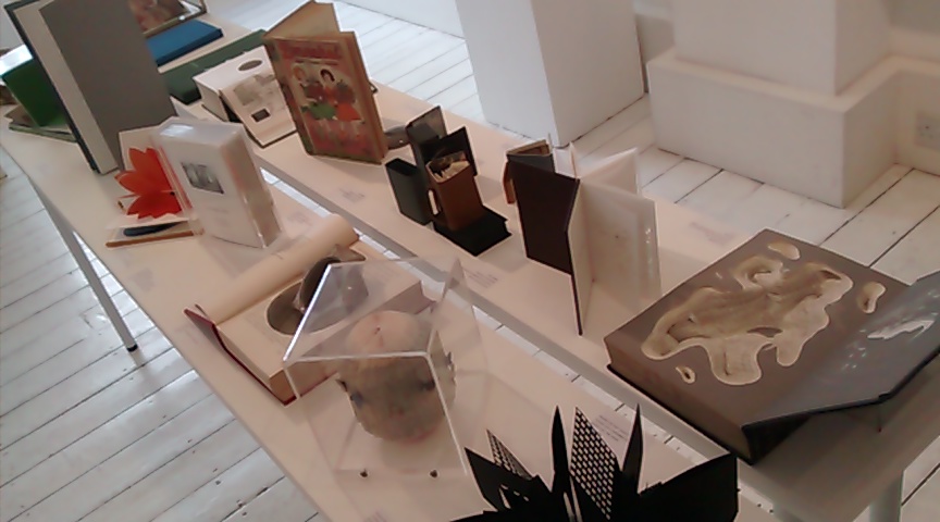
To give just a few examples: Monica Fierro carefully clips, shapes and scrolls individual leaves so that when the book she’s tweaked is spread open its cast of characters and scenes appear to literally burst out from its pages; while Chisato Tamabayashi cultivates a single, brilliant orange pop-up chrysanthemum bloom; and Tracey Bush presents ranks of carefully regimented butterflies, all culled from the colourful pages of antique cartographies. The dozen or so other artists in the show make similarly clever, creative bibliographical interventions, contributing to the marvelously Surreal little library that has temporarily taken over the gallery.
Further down the High Street, I pay a quick call into the Oxfam, bookshop to indulge in a slightly more traditional form of literary diversion, – rootling around through their collection of second-hand art books. Then it’s further south, across Oxford Street, down Dering Street and up in the tiny lift to get to Annely Juda. The upper gallery has a show of work by Friedrich Vordemberge-Gildewart one of the De Stijl group who, like his better-known colleagues, Piet Mondrian and Theo van Doesburg, was similarly involved in the creation of a particularly rigorous and pared down form of Abstractionism. A large display of pages from his sketchbook show him doodling around with the pencil studies of various geometric arrangements that formed the working studies for some of his larger more colourful paintings that are also on display here. In the lower gallery Philipp Goldbach continues this tradition of producing serious, slightly austere Abstract works but adds a more contemporary, Conceptual Art twist. So there are a series of photos of telephone utility boxes decorated with computer-generated graffiti tags; a range of very large, incredibly neatly soldered circuit boards; and an abstract wall of thin black lines that, on closer inspection, reveals itself to be comprised of thousands upon thousands of stacked up slides – in fact, it’s the entire archive of the Cologne University Institute of Art History.
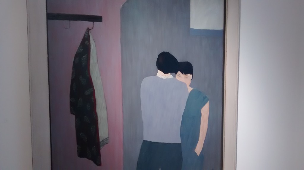
It’s all interesting stuff if a bit intellectually chilly and cerebral and not quite the metaphorical bunch of daffs that I was hoping to encounter. Never mind, I press on, although at this point I start to get a bit lost in my travels, wherein serendipity intervenes and happily I manage to bump into Beaux Arts, where the simple, figurative paintings of Anne Rothenstein provide a refreshing contrast to all that earlier Abstractionism. And, straight away, I need to stress that the adjective ‘simple’ is, on this occasion, very definitely meant as a compliment, since the artists manages to convey an awful lot of information and emotional capital within the stylised strokes and basic blocks of colour she uses to compose her characters and their intimate situations. Like looking at scenes cut from some swish domestic drama, it’s hard to resist constructing background stories for the actors involved in these situations. They’re the kind of paintings that would look very attractive above a mantelpiece or in a hallway – glanced at every day and occasionally contemplated for longer – never becoming entirely familiar, and always retaining their capacity to interest and intrigue.
I’m not so sure the same could be said for the paintings by Anne Joffe, next door at Victoria Miro. These portraits, painted in a deliberately crude manner, come across as sort of slap-dash caricatures and it’s tempting to dismiss the entire show as a succession of bad paintings of ugly people. And yet, despite feeling a strong urge to depart the gallery as quickly as possible in order to get away from this eccentric crowd, I find my attention caught, flicking from one painting to another, initially looking for some redeeming quality. Reluctantly I have to concede that perhaps there are one or two fortuitous accidents where the paint has drifted in a certain way that might well have captured the curious way a sitter sat, or her eyes narrowed, or her hair fell. But, before I get completely suckered into having to admit I could perhaps eventually convince myself that some of these dreadful paintings are not all necessarily quite as dreadful as they look at first sight, I decide I’d better move along.
Next it’s a quick look into Ordovas to see some of the monumental sculptures of the late Eduardo Chillida. And, I suppose if you’ve got a conservatory with a reinforced floor you might like to fill it with a great big block of rough granite into which the famous Spaniard chiseled a couple of very neat square holes, or give a home to one of his large, trademark rusty metal compositions. These interlocking shapes of sheet metal look like slimmed down ventilation shafts that have been twisted into approximations of the euro logo or the pound sterling sign.
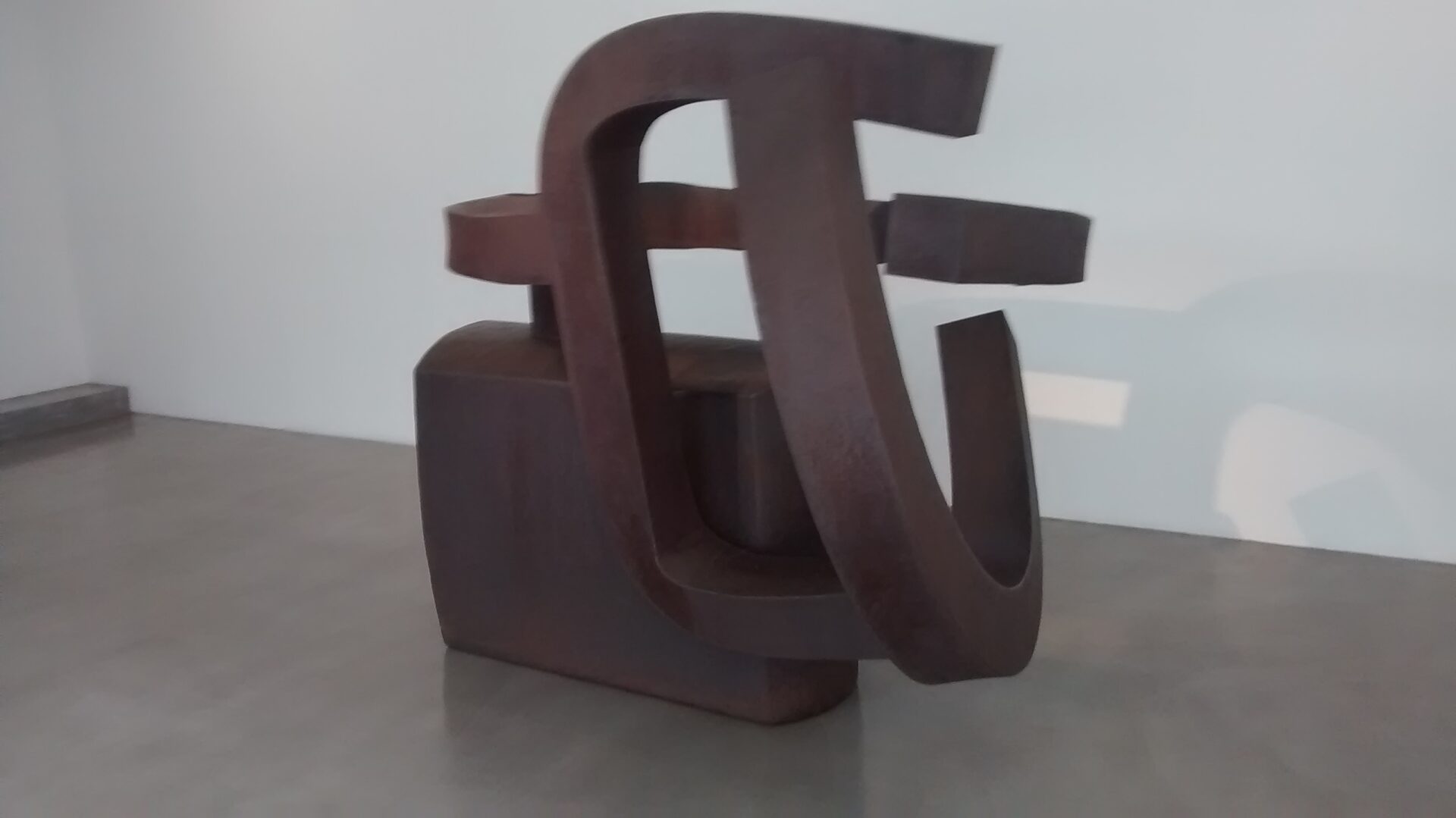
As such, they’re exactly the kind of slightly bland, inoffensive sculpture that is perfectly suited to stand outside one of those anonymous steel and glass structures that houses a bank or other bastion of corporate capitalist culture.
Across the road, one of the twin galleries of Hauser & Wirth is filled with a suite of rather boring paintings by Mark Wallinger, that resemble giant black Rorschach diagrams. Fortunately, the other space has much more interesting and entertaining video pieces. One of these follows the artist as he takes a stroll on a sunny day through Peckham or some similarly unexceptional London borough – the gimmick being that we don’t see the artist himself pounding these mean streets but just his shadow as it makes its transient mark on the paving stones, doorways and detritus strewn throughout our contemporary urban geography. It’s strangely mesmerising, as is the life-size projection of the fussy façade of a barber’s shop that perfectly fills one entire wall of the gallery. All is frozen still, except for the familiar small, red and white pole that continually revolves and declares the tonsorial services on offer within. It’s the most impressive piece of trompe l’oeil imaginable except, of course, when one succumbs to the temptation to approach the door of the shop, ready to ask for a short back and sides, a Tony Curtis or something for the weekend. Then, suddenly, the illusion is utterly and quite shockingly destroyed by the unavoidable imposition of one’s own shadow.
It’s all rather clever and as near to a golden host as I’m going to get but, nevertheless, I decide to complete the day by taking a couple of tube journeys and a complementary coach ride to reach the Affordable Art Fair in Battersea Park. There really is an awful lot of art to see here and, affordable though it may be, a lot of it really is rather awful. I realise that this sounds a bit culturally snobbish but there really are stalls and stalls and stalls all selling pictures that are poorly painted; or else pointlessly repeated copies of painfully clichéd subjects; or are examples of craft and design rather than art; or are simple combination of all three. Curiously, there are also a small number of booths that actually display paintings that are definitely worth a second look, although it takes quite a bit of effort to search them out. More curious is the thought that there are so many painters unsuccessfully filling so many canvases and so many little commercial galleries willing to display them.
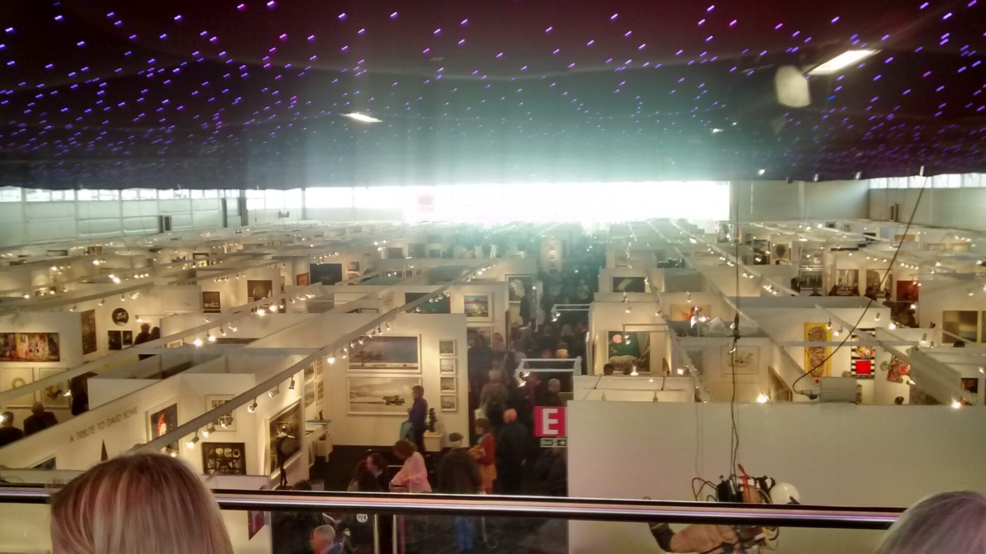
But most curious of all is the vast number of people wandering around looking at all this stuff – they’re clearly seeing something that I’m not, and I wonder what on earth it can be?