To Aldgate East tube station and then take the very short walk to the Whitechapel Gallery where I’m a bit surprised to find that there’s an entry charge to get in to see the show. I was under the impression that Gallery policy was to have just one of these charging exhibition a year with all the others free entry. But I guess things must have changed, since it cost £12 to get into the last big show, William Kentridge’s multimedia extravaganza that ended in January, and now it’s another £12 to see the Eduardo Paolozzi retrospective that opened up three or four weeks ago. Fortunately I don’t have to pay the entry charge as I’m already covered by my annual Whitechapel oldies membership pass which, at £30, seems a reasonable enough amount to pay in today’s straightened economic climate, especially as it means I can return to see this show and all the others as many times as I want to. And the current show is one that definitely deserves to be revisited a couple of times, not just because Paolozzi was an interesting artist who lived a long and varied life and created an impressive body of work in variety of media and styles – but more because the exhibition is so very crammed full of examples of his output that there’s really too much to take in comfortably all at one viewing.
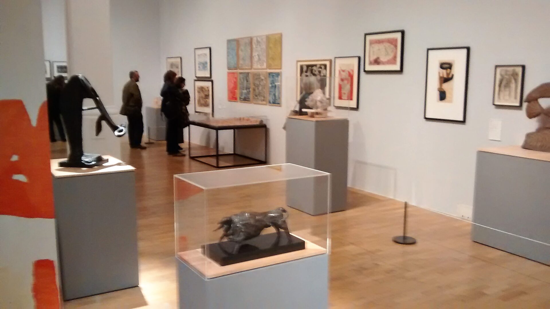
Were one wishing to be overly critical – a stance that I naturally always try to avoid – one might perhaps say that trying to display over 250 items from the Paolozzi emporium into the Gallery’s three major exhibition rooms, expansive though they may be, was a bit of a logistical miscalculation. And it’s hard to deny that, especially in the opening ground floor space where the show begins, the sculptures, prints, drawings and textiles do all tend to tumble into one another and overlap on each other’s sight lines. The result is a slightly chaotic situation not helped by the curious placement of labels on assorted columns and walls not very close to the artworks they’re meant to be identifying – a couple of times I had to get help from the invigilators in order to figure out the names and dates of the free standing sculptural pieces that I was meant to be looking at. Having said all that, I suppose the defence, for what otherwise might seem to be the rather curious curatorial decision of packing everything in so closely together, is that it provides a sort of echo of Paolozzi’s own favoured signature style of collage. And that, consequently, there’s a certain appropriateness that the artist’s life’s work should be similarly summarised by a sort of competing jumble of distracting images.

On the other hand, one could very reasonably argue that an artist of Paolozzi’s stature deserves to be given a full ten-room retrospective at Tate Modern. That way all the work could be sensibly sifted apart and discretely sited in separate rooms, with each of the thematic strands carefully delineated and untangled. Thus providing the opportunity for a more thorough examination of the artist’s personal evolution as well as a considered reevaluation of the role he played in the development of 20th century British Modernism. Which is all well and good, except that a reprise visit to the Tate’s current retrospective of Robert Rauschenberg – who, as a similar proto-Pop artist, could in many ways be considered as the American equivalent to the British Paolozzi – very clearly illustrates the potential downside to an overly academic approach to curatorial practice. In that rather disappointing show any potential gains in taxonomic art historical clarity and chronology are more than offset by the failure to convey successfully any sense of the changing spirit of the times that played such a crucial contributory factor in the actual production of the artworks – artworks that then specifically reflected back to its audience a craftily tweaked version of the people and events that made those particularly times so very interesting. At least the Paolozzi display does, deliberately of otherwise, to some extent capture the feeling of confusion and excitement and messy serendipity that the artist used in his work during that exceptional era when the world was pivoting between the end of the post-war austerity and the start of a new technical Modern Age.
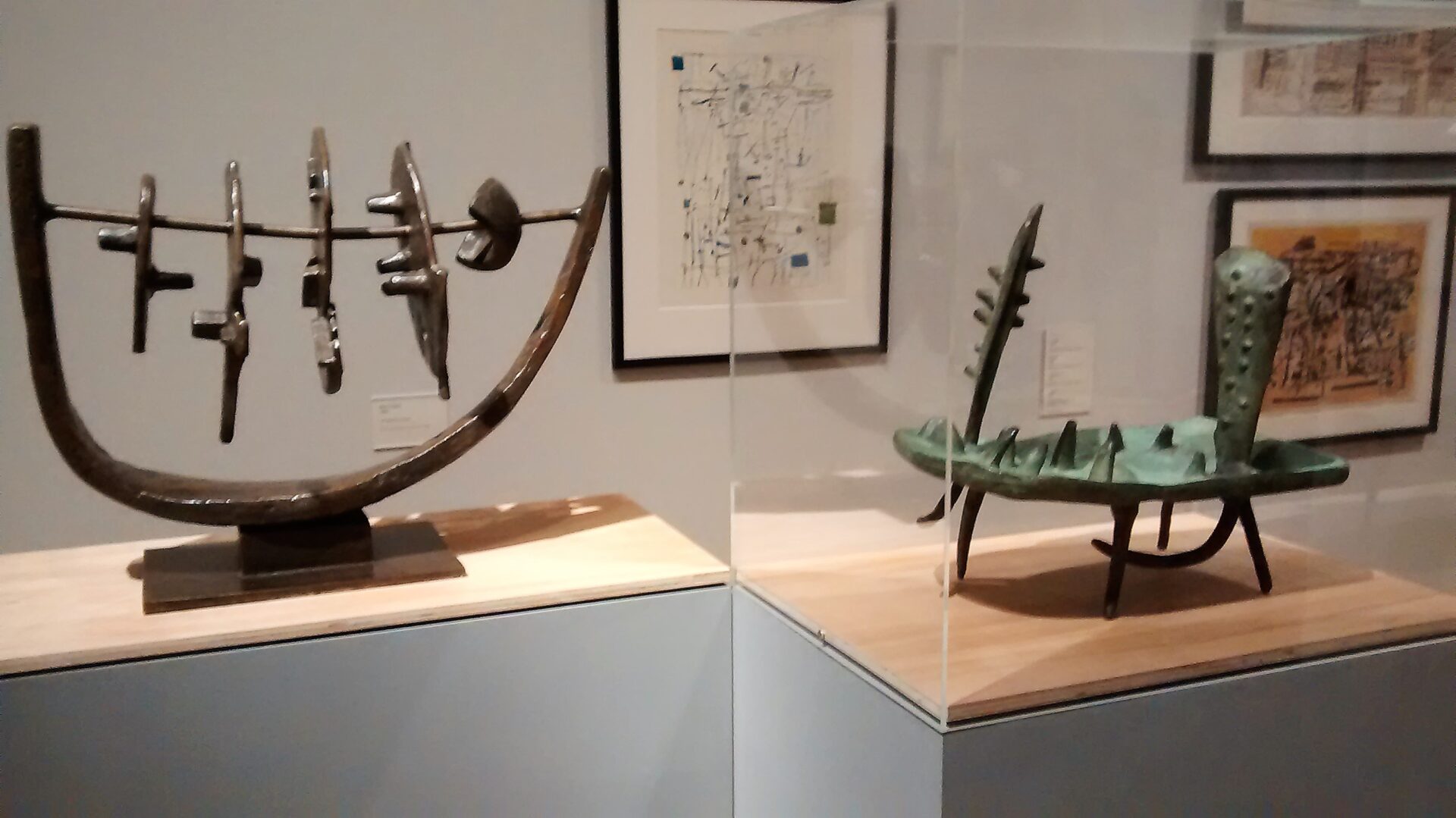
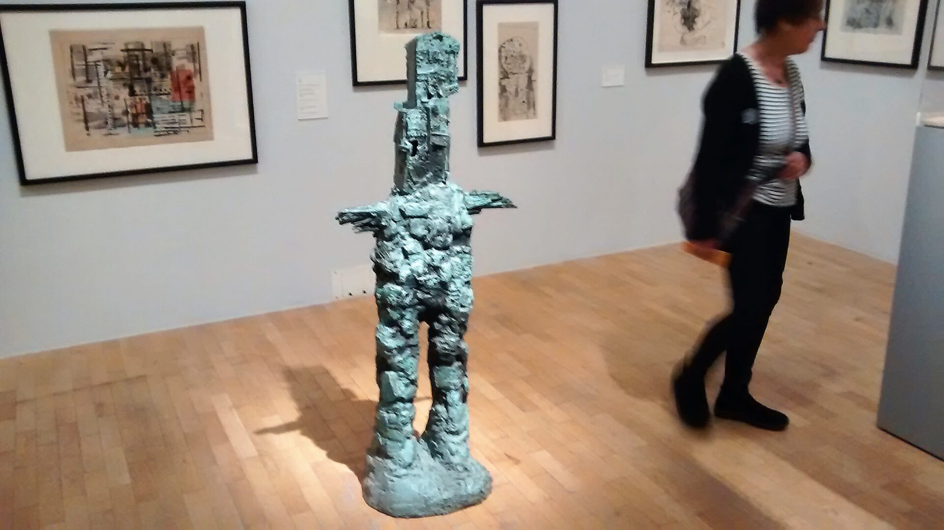
And, to be fair, with a bit of effort, it’s also just about possible to follow the early Paolozzi biography as the sculptor starts his career in the late 1940s, initially influenced by the stylised figuration of Picasso, and then goes on to draw inspiration from some of the early Surrealist experimentation of Giacometti (the non-figurative stuff he was making before he got obsessed with churning out of those strange spindly men) before developing ideas around the machine aesthetic that probably had their origins way back in the Dada designs of Francis Picabia. So, early concrete sculptures of animals, give way to a variety of bronze abstractions which are, in turn, superseded by series of machine men whose bodies seem to be amalgamated from crude constructions of cogs and gears. At the same time as he was making these 3-D works, Paolozzi was also playing with various doodled designs, some of which were turned into commercial fabrics, displaying the kind of controlled jazzy style that’s so redolent of the austerity aesthetics of late ‘50s and early’60 commercial stylings.
But then, of course, everything changes as the old European way of doing things starts to appear increasingly redundant and Paolozzi, seduced by the far brighter trash aesthetic of Americana commercial art and design, happily succumbs to all the fatal sugary attractions of pin-ups and pop stars; coca cola and cartoons, sci-fi robots and autos with curvaceous tailfins. Very suddenly all those serious statuette structures with their carefully patinated bodies in shades of dull green and black are swept away by a series of shimmering chromium plated abstractions and shiny polychromatic targets. And instead of refined designs for sensible cushion covers and curtains, Paolozzi gets hooked on fooling around with the unlimited possibilities of collaging together all manner of magazine images from circuit boards to car crash dummies and Mickey Mouse to Charles Atlas.

Seeing this work now, around half a century after it was first created, much of it still looks pretty sparky and sexy but if it successfully manages to grab the attention and tentatively titillate the visual cortex, then I’m not sure that it ever makes any very deep or long-lasting impressions. And maybe one of the problems of using throwaway imagery as the basic building blocks for artistic production is that the end results will similarly only ever have a transitory appeal. In short, while everything looks fab and groovy on the first take, there are no great individual masterpieces or any major memorable works from this period – at least, none spring to mind and if they do exist they haven’t been included in the current exhibition. Whether Paolozzi would have agreed with this analysis or, even if he had, whether it would have bothered him very much, is, frankly, unlikely as he seems to have been supremely confident of his own talents and value and utterly unconcerned about the opinions of others. Indeed, judging by the curiously idiosyncratic display of works created for his solo show at the Tate in the early 1970s, some of which start off the display in the final gallery here, he seems to have been only too pleased to have been given the chance to stick two fingers up at the art establishment and theorists of the day. A pile of aluminium ingots, individually stamped with the caption 100%F*ART, might not be an example of the most subtle or sophisticated form of humour and wit but at least it clearly conveyed Paolozzi’s evident opinion of the Minimalist style of art that was becoming fashionable at the time and pushing the vulgar stuff he was dealing in right out to the peripheries.

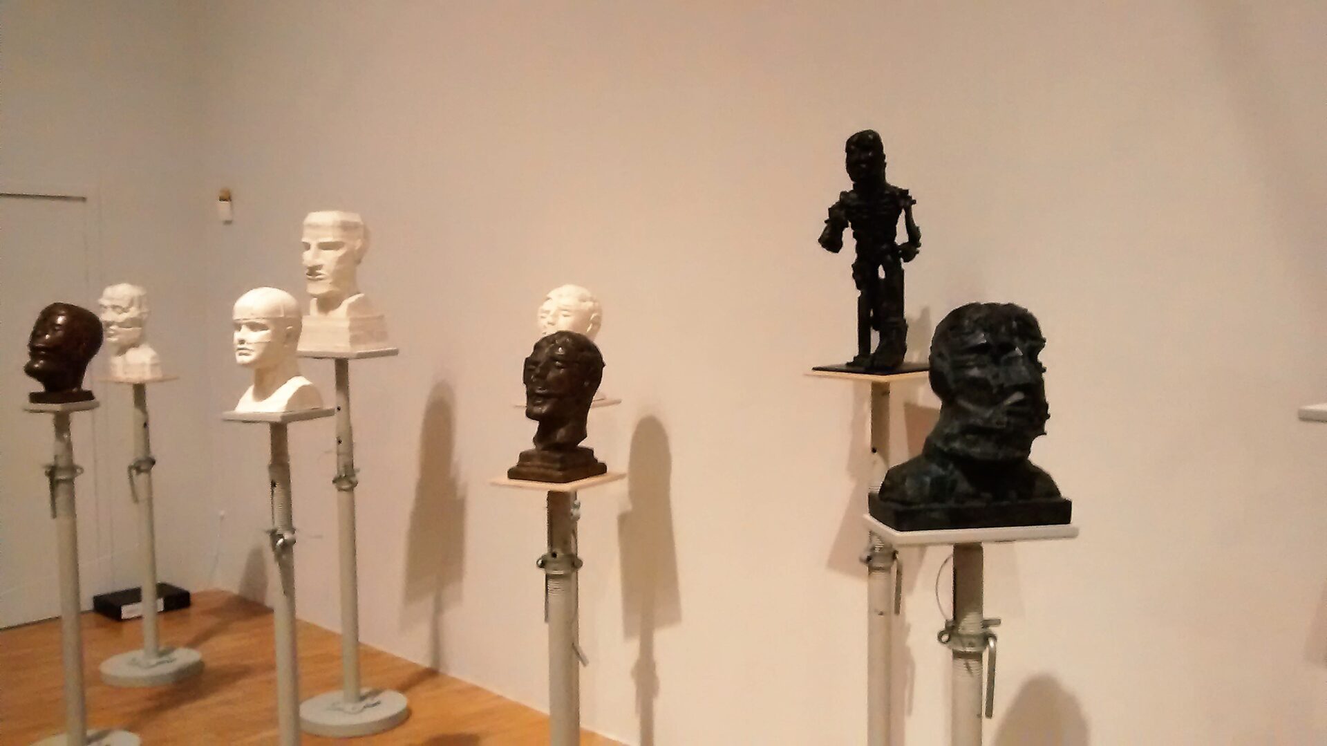
All of which leads up to the final act and Paolozzi’s eventual return to playing around with a form of stylised figuration exemplified here by an eclectic series of portrait heads that include those of the Japanese writer Yukio Mishima, the Austrian philosopher Ludwig Wittgenstein the British architect Richard Rogers, the Roman god Vulcan and the composite physiognomy of various other unidentified crania. It’s easy to look at these final, relatively small, monochromatic pieces and imagine that the artist was finally losing some of his former power, energy and flair and perhaps winding down into a more mellow, contemplative phase of production as he entered his seventh decade. In which case it might be worth taking a couple of tube rides to see some of the Brobdingnagian versions of this late style, notably the massive Head of Invention that rests horizonatally outside the new Design Museum; and Isaac Newton sat dividing up the world in the forecourt of the British Library. Best of all, head north and go to the Scottish National Gallery of Modern Art in Edinburgh where, in what strikes me as being an especially fitting memorial to a decidedly rambunctious artist, you’ll find the rather refined tea rooms have been crashed by an absurdly enormous and very full-bodied god of fire.