As regular readers may recall, last week’s blog rambled on to its happy conclusion at Pace London where there’s an invigorating display of the painting-cum-drawing-cum-collage combos that made Jean Dubuffet such a very interesting artist. As is well-known, the inspiration for all these quirky cartoonistic creations lay with the artist’s interest in the spontaneous, unprofessional drawings of children, and madmen and, more pertinently, the graphic designs of the urban graffitiologists, who scratched and scribbled their muralistic marks and messages on the brick and stone canvas of the Parisian city walls that surrounded them. Of course, Dubuffet had to use his own highly developed professional sense of design and structure to carefully temper, tame and ultimately transform the original urban folk art expressions into the stylised compositions that became his trademark. Nevertheless, his works still retain – or give a very convincing impression of retaining – the original energy and simple, unsophisticated honesty and integrity of the source material from which they were drawn. And, I suppose, it’s not completely unreasonable to suggest that Dubuffet’s works represent a sort of updated, psycho-geographical, post-war continuation of the tradition for producing contemporary cityscapes that was started by Manet, Sisely, Pissarro and their circle around about a century earlier. The point being, that the cartography of the city is not just a matter of geography but temporality as well, and that each new era of evolving urban life demands an equally novel style of art to have any hope of recording it with an appropriate level of accuracy and acuity.

And so, whether it’s the impact of industrialisation, that pushed the Impressionists to prominence; the existential angst that informs much of the intellectual activity and creative endeavours of the immediate post-war period; or the subsequent post-austerity consumerist boom and moral permissiveness that inflated the Pop Art bubble: styles of artistic expression must inevitably change with the times. And hence, in order to understand and appreciate the true value of any particular artwork it helps to have a reasonable knowledge of the social history of the times during which the piece was created. That, at least, seems to be the guiding light behind Boom for Real, the current Jean-Michel Basquiat exhibition that currently fills two full floors of the Barbican Art Gallery. Well, it’s one way to explain the amount of space here that’s been given over to displays of documentary ephemera – polaroids, video clips, book display, paper cuttings, notebooks and the like – that evidently aim to reveal just how edgy, exciting and groovy was the ambient atmosphere of the burgeoning Hip-hop scene of New York City in the 1980s, during which time the artist enjoyed his spectacular meteoric rise to fame before meeting with his subsequent tragic, untimely end. A more cynical person, however, might assume that the reason for the show’s curators having to pad out the exhibition spaces with all the extra, marginally interesting contextual stuffing is that the Barbican just wasn’t quite prestigious enough a venue to be able to persuade the super-rich private American collectors who own all the bigger better Basquiats to loan them their works.

Either way, the show is a bit of a disappointment and surely destined to reinforce the opinions of those who already know Basquiat’s work. For some he will doubtless remain an overhyped doodler, and the undiscriminating magpie who coated any surface that came to hand with an eclectic but meaningless steam of free-form letters, logos and crude cartoon caricatures. For others, the chaotic cascade of symbols and ciphers that he jotted down so manically will confirm him to be the consummate chronicler, wonderfully able to encapsulate the urban atmosphere of those proto-Post-Modernistic times with all the accompanying sampled, scratched and appropriated visual rhythms that provided its jarring background soundtrack. A smaller, better-selected, better-hung show in a lighter, brighter setting would, I think, show that Basquiat really was a unique and skillful talent, although it’s hard to tell how his form of exuberant, street-wise Expressionism would have fared against the wave of cool, commodified Conceptualism that subsequently came along to provide the next chapter in the history books of artistic endeavour.
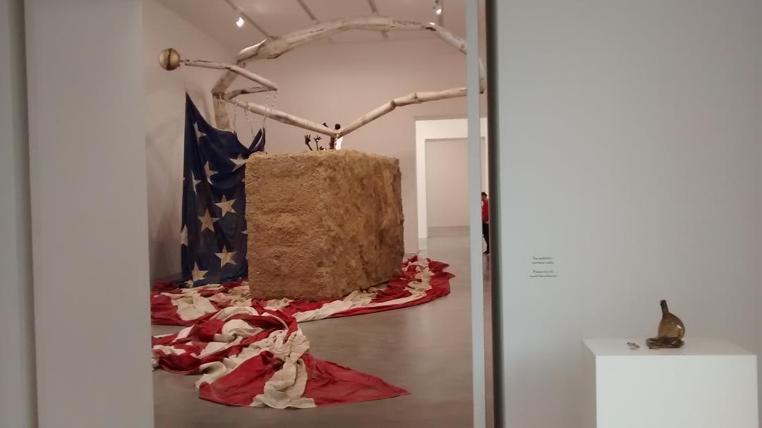
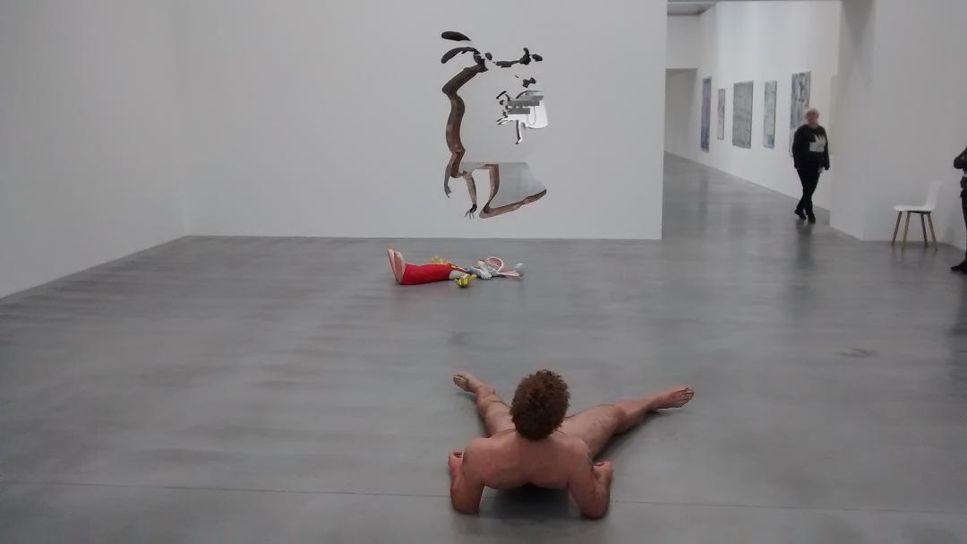
I think it’s fair to say that the poster boy for that kind of slick, some would say vacuous, art in America was Jeff Koons, with Damien Hirst being his dinky British side-kick. All of which leads neatly on to a consideration of the latest display filling the walls and floors of Hirst’s shiny white Newport Street Gallery. Sweet Liberty is a mini-retrospective of works from Dan Colen, an artist of whom I was previously entirely unaware but one who was clearly struck from the Hirstian mould and is most certainly a kindred spirit of his current promoter. With the indulgent mixture of naughty, irreverent, frat-boy aesthetics, comic book stylings, broad humour and perfectionist presentation, it’s easy to see why Hirst would have been keen to give Colen a show. For the rest of us, outside the club and looking in, I suppose the skits and ideas hit and miss with the usual very varied success rate, so that the massive American flagpole squashed and crumpled into the opening room is undoubtedly a powerful image, while the installation with multiple whoopee cushions is considerably less impressive. As for the running gag, that shows silhouettes of Wile E Coyote and pals crashing through gallery walls in a suggested chase format that culminates with the prostrate bodies of the participants spread out on the floor of the final room, well, the punchline is ok but I’m not sure it was really worth all the logistical effort that was required to conjure it up.
After that, it’s only a few hundred yards down the road to get to the Beaconsfield Gallery although, in metaphysical terms, the distance from the previous glib content and pristine surrounds to the humid archway that provides the darkened room in which Keith Piper’s specially commissioned video film plays, could hardly be further. If Colen’s art suffers from a tendency to embrace the trite and trivial, then I do slightly wonder if Piper’s extends maybe just a bit too far in the other direction and ends up in danger of being a bit too self-consciously worthy, not to say preachy and portentous. Mic Drop, is a ten-minute long film riffing on the eponymous rhetorical-theatrical device apparently employed by Barack Obama when he was President. I confess that I was previously unaware of the term or its significance but, apparently, the idea is that after delivering a speech, interview or whatever, if the speaker is particularly pleased with a performance then, instead of carefully replacing the microphone on its stand, it’s casually abandoned in a gesture of magnificent, insouciant triumphalism. In Piper’s film the President performs the ritual when concluding his final White House correspondents’ dinner speech. Subsequent clips collage together a teach-in about the digitisation of oral speech followed by brief references to the Brixton Riots, Brexit and the Trump inauguration. It’s all well-crafted, well-meaning stuff but I’m not sure that it says very much, and what it does convey is pushed out with little more punch than a MOR pop video.
![]()
For the final show of the day it takes a bus ride and tube journey to get to Southwark underground station and then a short walk up to the Jerwood Space in Union Street where there’s a mixed display of works selected from among the submissions to their annual Drawing Prize. Did I say mixed display? Well, that hardly comes close to covering the wide range of items that have been included within the very broad embrace of the term ‘drawing’ that the selectors have chosen to allow. Admittedly the majority of works on display are pencil sketches on paper but there are also folded origami constructions, woven fabric forms, bent metal sculptures, assorted video films and, most curious of all, an old battered plimsoll. I’m sure there’s a pun lurking around here about how one should really draw the line somewhere and I think, in my case, I definitely would have etched a zone excluding any examples of shabby, discarded footware. As for the more traditions lines, there’s a reasonable enough mixture of sketches that, on the figurative side, range from series of exquisite, perfectly-crafted photorealistic copies all the way along to crude diagrams expressed with a comical, childlike naivety. Similarly, when it comes to the abstracts, there’s everything on the spectrum here from the near-neurotic precision of the Minimalists to the wild abandonment of the Expressionists.

I can’t say that I agreed with the judges’ choice for prizewinners so, for what it’s worth, I’d pick out my favourites as Kate Black’s Horse with Blue and Orange, David Symonds’ All the Days of My Life and Richard Ducker’s Horizontal Hold No 9.

Ironically, in view of the earlier comments about Dubuffet and Basquiat, I don’t recall seeing any examples of, or any references to, any form of graffiti or Graffiti Art…until, that is, I made a pit stop on my way out of the gallery and noticed some floor tiles with a rather neatly scripted tag from Deathkid. I wonder if he could be the next Jean-Michel?

#deathkid lives